Wednesday, December 13, 2017

Final Project...Finally Complete...Finally

Overall this project tested my will and sanity to complete it.  And while I think I did well overall, I know that there was a key error somewhere in my analysis.  I think that error happened with my projections.  While I set everything to the same projection, I dont think it set right as when I did a comparison with GoogleEarth of my transmission line path, my lengths were greatly off.  Due to this I can only assume my acreage calculations were off as well. 

But it is what it is.  This was a solo project on a limited time crunch and I know that if this was the real thing, I would have been able to bounce ideas around like I normally do in the workplace. 

I will end this course knowing I learned much, more than I thought I would and I am really looking forward to using these skills in the future.  Below you will find some of the maps I created for this project.  Also you will find my full presentation and commentary in the following links.  Enjoy!

PowerPoint Presentation:
http://students.uwf.edu/jl130/Intro2GIS/Final_Project_Full_Presentation_JJL.pptx
Presentation Commentary:
http://students.uwf.edu/jl130/Intro2GIS/FinalProject_Slide_Commentary.pdf

Study Basemap

Conservation Area Impacts

Impacted Homes

Impacted Schools

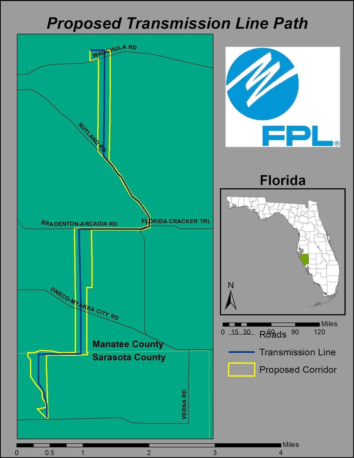
Transmission Line Path 


Thursday, November 30, 2017

Lab 12 - Georeferencing and Life Lessons in Frustration

Honest assessment for this lab.

Life, end of semester, and other factors have forced me to complete this lab a week late.  It is what it is and I take full responsibility.  All in all the georeferencing and use of ArcScene was pretty easy to get a grasp of.  Sometimes getting the right links to transform your images can be tedious, but it isnt hard.  It's actually pretty neat how you can get a polygon layer to line up to the raster using this tool.  As you will see in my first map, everything turned out great (or so I think).  However my frustrations and lack of available time to redo pretty much the georeferencing of the south raster has driven me mad.  Here is what happened.  I completed my first map.  Saved my working file and created a final file as well and then closed ArcMap.  I opened up ArcScene and added the necessary files to the layer.  However my south campus raster was nowhere to be found.  It lost my transformation data.  I opened ArcMap back up and sure enough, the south map information was lost.  Due to my time crunch, I then just took the snapshot from ArcScene and you will see how that at least turned out.  Again, I take responsibility for it, but sometimes redoing the entire project isnt worth the frustrations it causes.  So, enough ranting, here are my maps for the week:


Friday, November 17, 2017

Geocoding

This week saw some delays in me completing the lab, but hey, I got it done.  This one was pretty neat in that I got to act a bit like GoogleMaps in creating at routing network for selected EMS Stations.  First we created the network nodes for all the EMS Stations in Lake County.  Then I was able to select a few stations and an additional point to create an optimal route from.  Below is the output.  Enjoy!


Tuesday, November 14, 2017

Supervised Classification

This lab was actually a fun one.  I enjoyed creating the different feature signatures and determining what was the best way to bring them all together.  So the final exercise that you will see below was a supervised classification of Germantown, MD and its surrounding area.  Many features were created and in the end all similar features were combined into 8 total classes.  The map was then created from this and included a distance image as well.  Suggestions are always welcome for my color schema, with names preferably as I can't always distinguish by color alone. 


Thursday, November 9, 2017

Vector Analysis 2 - Finding a Place to Camp

Good evening readers!  This weeks lab focused on creating vector buffers using a couple of tools within ArcGIS.  We even got to learn a very small bit of Python using the AcrPy toolset.  First we started off conducting a buffer analysis on a couple different layers, those being roads and water features.  We did this using the buffer tool in ArcGIS.  After we did this we got an additional lesson on how using Python can help expedite these types of functions when you have to repetitively do the same thing over and over and only one variable changes...HUGE time saver for sure. 

Next we learned how to combine our different buffer outputs using the overlay functions. Primarily we focused on using the union overlay to join our water and road buffers, but guess what, the intersect overlay achieved the same results.  Then we learned how the erase overlay can help delete some features as well.  When all was said and done, I had enough data to develop the map below.  So if you find yourself looking for a camping spot in the Desoto Forest in Mississippi, this just might help!


Tuesday, November 7, 2017

Unsupervised Classification of the UWF Campus

This week we looked at using tools in both ArcMap and ERDAS Imagine that help conduct unsupervised classifications.  The map below was initially created in ERDAS using the Unsupervised Classification tool and having it assign a pixel value to one of 50 classes.  From there I reclassed the 50 pixel classes down to 5 color classes.  The resulting image was imported into ArcMap and the results are below.  Another element of this map was to determine how much of the land on UWF was water permeable based on the determined land classes.  So here it is:


Tuesday, October 31, 2017

Thermal & Multispectral Analysis

This week focused on using two different image spectrum to analyze and determine what features we are looking at.  Sometimes you cant determine what something is in one spectrum, so it is helpful to look at it through different lenses to really see what is what.  One example in the lab this week was finding a bright white spot in a thermal image that is surrounded by dull greys and blacks.  Through thermal imaging alone, you cant really tell what it is.  You just know that whatever it is, it's emitting a lot of energy.  By looking at the same point through a multispectral lens, you can then see the smoke coming off the ground and therefore infer that you are looking at fires of some sort.  Just one example of how different spectral bands can help paint a full picture for analysis.  

So for this weeks project I chose to use Spencer Field, a Naval airfield that is just north of Pace.  I chose to show a comparison between the thermal and multispectral images to show just how different things look, but how they also stand out in their own rights.  The full description is in the map below.  Enjoy!!


Thursday, October 26, 2017

Data Search Lab

You have to love it when you start to get to a point in your map making process where you end up spending 4-5 times more effort and time finding the data you need than you do making the actual maps.  That was the case for me this week.  Some issues encountered were: simple trial and error to see if the data displayed was what I wanted, inability to find exactly what I wanted, and overall just getting more familiar with what I can find from certain sources.  Once I obtained all of my data, I made the following three maps.  I think the way I grouped the data in each map makes sense.  Feel free to comment below with any suggestions.


Map displays Hillsborough County and tries to highlight a section of Tampa


This one combines elevations and rivers along with wetlands and parks.  I thought these pairings were interesting as the elevation shows were rivers and streams are and the river vectors confirmed this.  I also found it interesting how the state parks in the county were centered around some of the larger wetland concentrations.  

This map simply shows where certain invasive plant species are found in the county.  Unfortunately due to the large number of different species available, they aren't easily distinguished on this map.  The data would be going for highlighting certain plant species if you knew what you wanted to show.  


Tuesday, October 24, 2017

Multispectral Analysis

This week we delved into multispectral analysis primarily focused on using ERDAS Imagine.  We looked at histograms of both greyscale and multispectral images and then used a breakpoint feature to isolate pixels in certain ranges to help identify what features we were looking at.  For the final exercise we were to determine three different features using the skills we learned and then create maps for each feature.  These maps are below along with a description of what I was trying to highlight. 


Feature 1: Water in general.  By adjusting the breakpoints on the greyscale layers, I was able to isolate the target peak on the histogram and verify that it matched up to a single feature.  Map is displayed in TM False Color IR.


Feature 2:  This feature are the snowy areas on the mountain peak.  Again, by adjusting the breakpoints on the greyscale layers, it was easy to see that the snow was the target.  This was especially true for layers 1-4.  However layers 5-6 also included the water features along with the snow.  So therefore, the snow has to be the feature as it was the only one that was visible on all 6 layers.  I displayed the map for this feature in TM False Natural Color as it distinguished between water (dark blues/blacks) and the snow (light/pale blue)


Feature 3: For this I chose the river mouth that feeds into the bay area.  Again I used breakpoints on greyscale.  For layers 1-3, and even 4, the river discharge is distinctly different than that of the water in the bay.  For layers 5-6, you cannot see any different between the discharge and the body of water.  For this map I used an inverted TM False Natural Color.  R:3, G:4, B:5.  This made a distinct looking map and highlighted the discharge in red as it entered the dark blue body of water.   

Tuesday, October 17, 2017

Spatial Enhancement Techniques

This week's lab focused on applying different filtering techniques to images to achieve certain effects.  Both ERDAS Imagine and ArcGIS were used to achieve these effects.  Some filters would add some blur to the image while others would sharpen edges and pixels.

My map this week applied a few different filters that were aimed at minimizing the striping effect on the base image while preserving as much detail as possible.  My map below illustrates my process of using a Fourier Transformation filter followed by using spatial convolution filters.  The convolution filters were applied in the following order: Sharpen 3x3, High 3x3, and then Low 3x3.  The result can be seen below.


Striping could not be fully eliminated, however I was able to get it to better blend with the medium greys in the image.  I was also able to maintain decent detail in the urban areas as streets and city blocks can still be easily distinguished.  

Thursday, October 12, 2017

Projections 2

This week has probably been one of the more frustrating thus far for the course.  However out of frustration comes learning through repetition as you have to go back and redo your work over and over again...lol

So working more with projections and defining projections for map files that are undefined, there is a key order for doing these actions or, as I learned, you mess things up.  My biggest mess up was importing the X/Y data for the STCM information.  I went straight to defining the information as the NAD 1983 (2011) projection.  Problem was is that this placed all the points off the coast of Louisiana and you had to set the scale to 1:1.5 to see all the points.  The key step I had missed was defining the STCM data in WGS 1984 and then projecting to the NAD 1983 (2011).  Doing this fixed the problem and I achieved the result below.


Next week...start working on the dreaded midterm lab...but Im ready for it...so I think.  

Thursday, October 5, 2017

Map Projections

The most interesting thing I learned this week with the lab was how much a map differs based on the projection the data is based off of.  While sometimes the difference is faint (visually), there are times that certain projections will cause a significant distortion on the map you are working with.  

So this week we focused on the map projections: Albers, UTM, and State Plane N.  While it is difficult to visualize the differences in the map below, the data that is presented in the table shows how much the square mileage of select counties differs across the three projections.  See for yourself below.  If you have any suggestions on how to make this better, feel free to comment below.  

Tuesday, October 3, 2017

ERDAS Imagine and Importing Imagine Data Into ArcGIS

This week was a fun introduction into ERDAS Imagine and illustrating what it can do.  We saw the difference in what AVHRR and TM files can show us.  Also with the TM photos, we were able to manipulate the vision spectrum to help identify different land features. 

After working through some of Imagine's features, we created a subset of a TM map and used that within ArcGIS to develop a map which showed how much area in hectares of each land type feature that were highlighted on the map.  One issues I was not able to overcome was reordering the legend on the map.  Personally I would have preferred sorting the legend by most to least hectares.  Definitely a challenge I will need to figure out down the road.  The picture below shows my map from ArcGIS. 

Thursday, September 28, 2017

Sharing GIS Maps and Data

So this week's lab, while time consuming, really wasn't that hard.  Which sometimes is a good thing. 

This week we used ArcGIS Online (AGO) for the first time.  There was some moving of data back and forth between ArcGIS and AGO.  We also used data created in ArcGIS to create a .kml which was imported into Google Earth.  Again, while long, it was fairly simple. 

Here is a link to the map I created on AGO:  http://arcg.is/1z4fHm

That's it for now, see you next week!

Tuesday, September 26, 2017

Ground Truthing and Accuracy Assessment

Whew...this lab was somewhat exhausting.  Mostly because I was really not happy with how the previous lab turned out.  Since this lab was supposed to use last weeks lab as a baseline, I felt the need to redo last weeks lab and give myself a better start point.  Ultimately, many lessons were learned and more experience with the different tools of ArcGIS was gained.

So this weeks lab focused on ground truthing and accuracy assessment.  As we were not able to properly visit Pascagoula to conduct our In-Situ assessment, we used Google Maps and in particular the Street View feature built into it.  This allowed us to get down to "street level" and verify whether our LULC codes that we used in Lab 3 were accurate or not. 

Overall, I had an accuracy of 81.25%, which isn't too bad given my limited experience.  The majority of my inaccuracies came when the point I selected happened to be by a small church or something similar that originally appeared as part of the neighborhood developments.  Also given the small point, the overall LULC that was assigned overwhelmed it. 

This was a frustrating exercise at first, but then it all clicked and I was able to get through it fairly well.  Below is a copy of my output.  See you all next week!


Thursday, September 21, 2017

GIS & Cartography

This lab focused on mapping skills using GIS software.  There was some learning reinforcement of different tools like the essential elements as well as using inset maps.  Also so additional advanced features like highlighting within the inset what region we are focused on as well as adding the raster maps to the mix.  Personally for this lab I would say that the maps will speak more than I could ever do, so here they are. 


Map 1 shows the states of Mexico and what the population is in each state


Map 2 focused more central Mexico and brought in the elements of roads, rivers, railways, and major urban areas


Map 3 simply shows the topography of Mexico using a red (low land) to yellow (high land) color range

As I preface everything, if the colors seem off, please let me know in a constructive comment as I am color blind and what makes sense to me most likely doesnt make sense to most others.  If it works, great, if not, suggestions are always welcome.  

And with that, I will end this post.  Happy GISing!!!!

Tuesday, September 19, 2017

Land Use, Land Cover Map

This lab was a test in my patience and a wish or desire to have a digital pen vice a mouse for completing it.  The purpose of this lab was to identify certain areas of a map and label them with the appropriate Land Use/Land Cover (LULC) code.  Using the skills we learned the previous week for  identifying certain land features along with our own personal knowledge of what different pieces of infrastructure looks like, I was able to go through and mark the key points in the map.  Some things I learned going through this lab and will need to apply (redo) for next weeks lab: 
1.  Large to small - definitely need to mark larger areas, like residential, first and then create the smaller areas, like commercial/reservoirs/etc, within the larger area.  I think this will create a cleaner look for future maps.  For this map I dove right into marking the marsh areas and then other smaller areas I easily recognized.  The order should have been something like big water area -> marshes -> beaches or residential -> commercial -> industrial -> reservoirs or something along those lines. 
2.  Work through zooming in and out and panning while creating the larger polygons.  More vertices will create a cleaner look and leave you less prone to overlapping polygons.  Despite using the snapping tool, I'm pretty sure I had some overlap in there. (Yes, I just dimed myself out)
3.  Something I need to figure out as I think in the future it would make for a more interesting map presentation is how to do different color polygon borders within the same shapefile.  Now this may not be feasible and multiple shapefiles would be needed, but I think color coding the different LULC types would make for a better map presentation as it would make it easier/quicker to identify different entities.

So that is it.  I will definitely be reworking this for future use.  And without further ado, here is my map:


Thursday, September 14, 2017

Owning Your Map - Take 2

One of the joys of taking multiple GIS classes at the same time is that sometimes the assignments are duplicated.  While some may balk at this kind of rework, I took it as an opportunity to reinforce my learning through repetition.  This map again is doing the Own Your Map lab, however this version had more elements that the previous version.  The main addition to this map was using the Florida cities shapefile and weeding that down to only what we wanted to show on the map.  Not much else to say about this version over my previous Own Your Map lab.  So without further ado, here is my map!


Tuesday, September 12, 2017

Photo Interpretation - Lab 2

If I have to say one thing about doing this course with no GIS experience, it is definitely helping my Intro to GIS course that I am taking at the same time.  I constantly have to bounce between lesson materials from both classes so I can figure out how to do what I need to do.  It is a lot at times, but the more I do this, the more familiar I hope to get with the tools.

So Lab 2, Visual Interpretation.  This lab was all about learning how to identify features and attributes on a photograph.  Different photographs were used to include grey scale, true color, and false color.  The first exercise focused on a grey scale photograph and the objective was to identify different tonal and texture levels on the map.  The map below illustrates what I identified for the different tones and textures.


The second exercise focused on identifying different features based on shape, size, shadow, pattern, and associations.  This I found to be more fun as I quickly recognized the map to be Pensacola Beach from what appeared to be 1970.  It was interesting to spot the key features that are still there and also take note of what is no longer there as much has been developed in 47 years.  Have a look at what I came up with in the map below.  


While the final exercise in this lab did not require an output map to be created, I still went through and identified 5 features on a true color photograph and noted what I thought they were and what colors they were.  The interesting point came when the false color photograph was put over the top and seeing how the features I selected changed colors.  While I am sure my interpretations of what the colors are slightly skewed due to my color blindness, there were clear shifts in color going from the true color photograph to the false color.  

Over all this lab was fun, albeit a little tedious as I am still learning ArcGIS.  But the more I work with it, the easier I am sure it will be further down the road.  

Tuesday, September 5, 2017

Owning Your Map

Well, this was my second foray into ArcGIS.  This one was simply creating a map showing the location of our beloved UWF within Escambia County.  The map included an inset showing where Escambia County is in relation to all of the other counties within Florida.  The map building exercise was fun but I really struggled with the metadata.

Through the help of Amber Bloechle, I was able to find alternate means of finding the information I needed within the metadata.  This was a huge help and is a key piece of information that I hope to retain for future use.

So here is my map, hope you all like it!


Thursday, August 31, 2017

Getting My Feet Wet In ArcGIS

So here we are, week 1 of classes and my first lab for Intro to GIS is complete.  I have to say that for an "overview" of ArcGIS and its basic functions, the lab was a bit more difficult than I had expected.  Finding some of the tools wasn't as intuitive as I would have expected for such and advanced and popular tool.  Because of this, I found myself reading the lab instructions many times over before I figured out what was supposed to be going on.  Perhaps there are some version discrepancies between the provided instructions and the current version of ArcGIS that is available on the eDesktop.  Ultimately I made it through and I created this awesome map:
This map displays the countries, and the major cities, of our wonderful planet.  The differing colors delineate the population densities of the countries.  You will also find some key tools at the bottom of the map such as the cardinal direction indicator, the map scale in kilometers, and the color legend for the different population densities.  

Now I am going to give a disclaimer and submit a request for suggestions.  I am color blind.  Red/Green, Red/Brown, Blue/Purple...it is what it is.  So if you see any colors that clash or just look off, please provide some suggestions so I can make it better.  I try to keep things along a single color spectrum or grey scale to avoid these complications, but I anticipate there will be maps in the future that are just going to look off.

So that is it.  First lab done and I am quite excited to delve deeper into ArcGIS and really see what I can do with maps.