Sunday, February 18, 2018

Spatial Statistics

This week we learned about how to apply spatial statistics to data inside a map.  The training provided by ESRI covered different aspects of geostatistics.  The first things learned in the training were how to apply a mean center, median center, and the directional distribution to a map in ArcGIS and what this actually means in the context of your data.  These tools basically show you where your data lies directionally and where it is centered.  You will see these applied to the map below. 

Next the training focused on histograms and QQ plots and how to interpret what those graphs display.  These are good tools to determine if your data is normally distributed or not and they are also good for finding outliers in your data. 

Finally the training focused on identifying outliers and conducting trend analysis.  Some tools to assist in identifying outliers included using Voronoi maps and semivariogram clouds in addition to the histograms and QQ plots learned earlier in the training.  Trend analysis was also conducted in ArcGIS using the Explore Data > Trend Analysis tool in the Geostatistical Analysis toolbar. 

The map I created below shows the weather monitoring stations in western Europe.  This map highlights the mean center and median center location as well as the general directional distribution of all the points.  A full explanation is included in the map itself. 


Sunday, February 11, 2018

Cartographic Design - Ward 7 Public Schools

The focus of this lab was to apply Gestalt's Principles into creating a map of all public schools of Ward 7 in Washington D.C.  These principles are visual hierarchy, contrast, figure-ground relationship, and balance.  Here is how I achieved each principle:
  • Visual Hierarchy - The most important items should stand out and that is the case here with Ward 7 itself, the schools we are identifying, the titles, and finally the legend.  All other elements are lower on the scale of importance and are therefore subdued or de-emphasized so they don't draw the reader's attention away prematurely.
  • Contrast - Contrast was mostly applied to the schools.  The red color stands out against a white and grey background.  The school symbols have contrast within themselves as well as their different sizes indicate what type of school they are.  The call out box in the locator map is also a form of contrast as it is bright yellow and that stands out from its surroundings.  
  • Figure-Ground Relationship - For this a couple of techniques were used.  1.  Ward 7 is brighter than the surrounding areas.  2.  The roads are mostly subdued (grey in color) to allow the school icons to stand out better. 
  • Balance - Balance was achieved by placing Ward 7 in a location that best filled the map space.  Then the locator was placed in the empty area in the top left of the map space.  The legend, scale bar, north star, and additional information was placed in the bottom right empty space.  For the top right empty space there wasn’t much left to add to the map, balance was achieved from the top left and bottom right corners, but the space felt empty.  So I decided to label that the colored space (matching the locator) was still indeed Maryland.  
Overall I think the map came out ok and some new skills were learned in Illustrator.  One thing I would like to learn in the future is how to make the roads that have dead ends round out vice remain open as they are in my map.  I did learn the neat trick of using multiple strokes in Illustrator to achieve the hollow road appearance, so I was happy with that.  I do hope that my color choices are acceptable as I always caveat that I am color blind, so these seem ok to me.  Leave your thoughts, comments, and suggestions below as they are always welcome.  

Cheers!


Sunday, February 4, 2018

Learning the Typ-to-the-Ography

This week's lab focus on Typography and reinforcing essential map elements.  Our instruction focused around creating a map, which you will see below, of Marathon, Florida located in the Florida Keys. 

An initial base map was created in ArcGIS which was then exported as an Adobe Illustrator (AI) file.  AI was where the predominance of work was done on this map.  The focus of work was to create a map of Marathon, identifying key (no pun intended) features utilizing typographic principles, and ensuring that we properly included key map features.  An inset map, indicating where Marathon is in relation to southern Florida and the rest of the Keys was included as reference. 

My map, again below, focused on 4 labeling standards.  All cities are Arial 12pt.  All keys (islands) are Arial 10pt.  All water features are Arial Italic, 60% grey in color, and sized to fit the feature.  I also used symbols, identified in the legend, to identify random features and to reduce word clutter on the map. 

Some custom features to this map include drop shadows, path text for the title/subtitle, and a unique border. 

Without further ado, here is my map.  As always, comments and suggestions for improvement are welcome below. 


Sunday, January 28, 2018

Getting My Fingers Wet in Adobe Illustrator

This week's module had us get into Adobe Illustrator.  This was a first for me and took some time getting around all the ins and outs of the program.  I have limited Photoshop experience from long ago, so that at least helped me navigate some of the basics, in particular that of managing layers. 

One thing I learned about was the power of scripting to make mass changes easy.  Take this for example from my process summary:

"For this lab I did a google search to find a symbol changing script.  I found one created by an Adobe user named Jet and it was linked on another user’s webpage.  I downloaded the script, selected the symbols I wanted to change, and then ran the script.  After the script was completed, I had to move the changed objects back to their appropriate sub-layers.  The file for the script was saved for later use."

My personal design preferences may not be the best.  I have never claimed to being artistically competent in any fashion.  To complicate things, being color blind doesn't help much.  So with that stated, I do welcome any suggestions that anyone cares to offer as a comment to this post.  

Below is a copy of the map I created for this module.  Hope you enjoy it!


Saturday, January 20, 2018

This week we learned about early history of mapping and also key map design principles.  Based on these principles, we were tasked with finding what we thought was a well-designed map as well as a poorly designed map.  Below are my examples along with my brief reviews of the maps. 

Well-Designed Map


Overall, I feel this is a well-designed map.  The key Map Design Principles (20 Tufteisms) I feel this map most meets are:
  • ·         5.  Graphical excellence requires telling the truth about the data: There is no further truth on this map than depicting the correct locations of the archaeological sites on the map.
  • ·         7.  Clear, detailed, and thorough labeling should be used to defeat graphical distortion and ambiguity: Labels are used throughout the map, where labeling could become ambiguous, lines are drawn from label to point, defeating any uncertainty about what is being labeled.
  • ·         13. Above all else, show the data: Clearly the data is shown in this map.  All archaeological sites are clearly depicted on the map.

For my own preferences and as a tourist to this island, I like how this map shows where key points are, how I could possibly get to them using the island’s road infrastructure, and despite being colorblind, I am able to distinguish the elevation levels on the map which would tell me how hard of a hike I would have if I chose to walk to some of these sites.

Poorly-Designed Map


Overall, I feel this is a poorly-designed map.  The key Map Design Principles (20 Tufteisms) I feel this map most meets are:
  • ·         2. Graphical excellence consists of complex ideas communicated with clarity, precision, and efficiency:  This map was single minded and did not clearly convey its message. 
  • ·         3. Graphical excellence is that which gives to the viewer the greatest number of ideas in the shortest time with the least ink in the smallest space: In my opinion, this map failed to do this.  The symbology was grossly inappropriate and didn’t tell the correct story.  Much time had to be invested to determine where even the capital cities belonged and if one was not familiar with their states/capitals, it would be difficult to determine what is what on this map.
  • ·         9.  Show data variation, not design variation: Here is where I don’t feel that the designer effectively displayed the variation in data in a way that makes it easy to interpret the map, let alone gather what message they were trying to convey.  What does it matter if a capital city has a large population or not?  What are you comparing that to? 

My critique of this map and suggestions for improvement would involve mainly redesigning how you display your capital city population densities.  I would suggest using color variations vice size of the symbology to convey this message.  Then, the symbology could be placed correctly at their appropriate locations on the map.  Next, I would find the “so what?” to compare it to.  What does a state capital’s population density mean compared to “X”?  Finally, more map elements: scale bars, more effective legend, maybe a text box explanation of what is going on.  There is much to improve upon in regards to basic map elements.  

Friday, January 12, 2018

Hello Fellow Computer Cartographers! I'm Jason!

Hello Everybody!

As the title says, I'm Jason and I will be joining you all in this fun mapping experience we are about to embark upon.  A little about myself: I am 38 years old, married, and have two kids (ages 14 & 10).  I have a BS in Computer Science and I am working on a second BS in Environmental Management.  This second degree is just buying time as I work through the application process for the Master's program in GIS Administration.  During my 20+ years in the work force I have worked in metal injection molding (we made small metal parts), I have been an officer in the Marine Corps (recently left the reserves as a Major), and since I left the active duty Marine Corps I have been working as a consultant with Booz Allen Hamilton where I have been on contract with the Navy for the last 4 years doing cyber security. 

This will be my third/fourth GIS related course that I have/am taking here at UWF.  Last semester I completed Intro to GIS and Photo Interpretation/Remote Sensing.  This semester I am of course in this cartography course and am also taking GIS Management (an approved Master's level course). 

My main goal right now is to execute a career transition from cyber security to that of forest management with the US Forest Service.  This is the main reason as to why I am back in school while still working a full time job to support my family. 

Adjectives that describe me: stubborn, determined, goal minded.

Below is my Story Map.  You will see that I have been a few places in the world, some are pictured in the map, some are not.  I have also been all over the USA.  If you like what you see or have any questions about me or where I have been, comment below!


Story Map: http://arcg.is/2r3nwTG

Wednesday, December 13, 2017

Final Project...Finally Complete...Finally

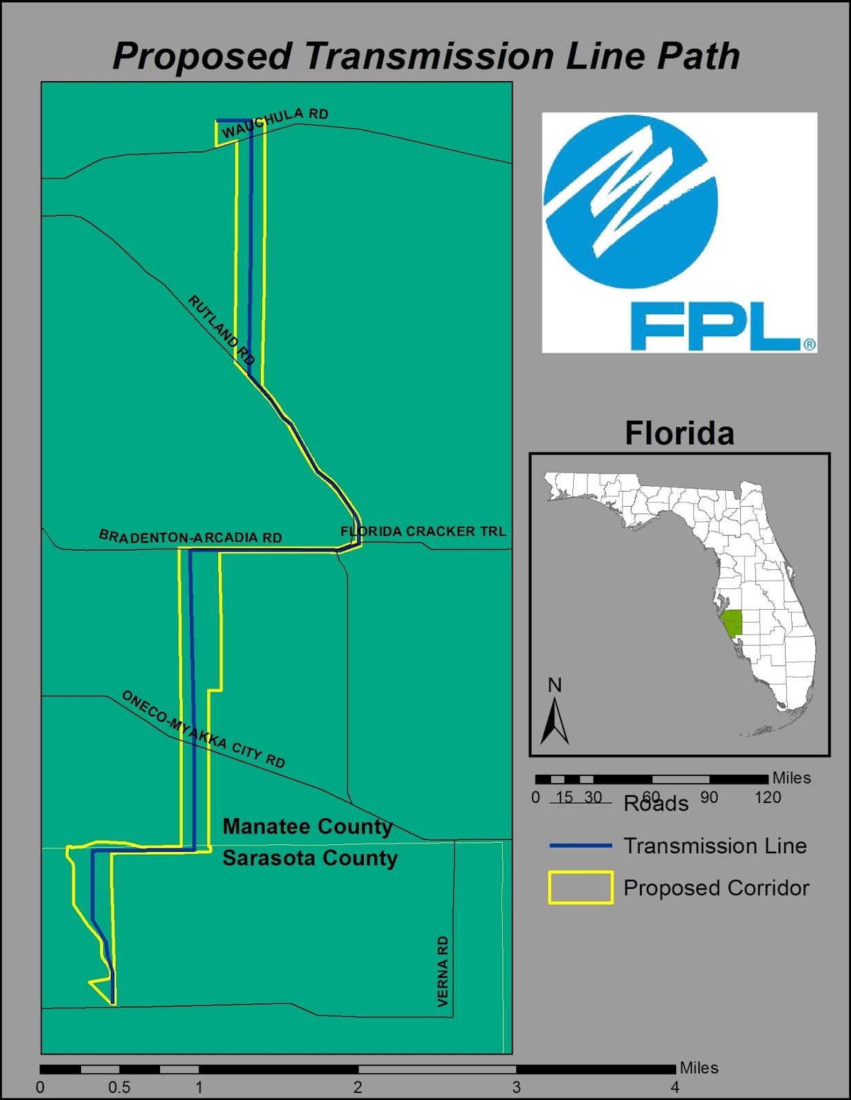
Overall this project tested my will and sanity to complete it.  And while I think I did well overall, I know that there was a key error somewhere in my analysis.  I think that error happened with my projections.  While I set everything to the same projection, I dont think it set right as when I did a comparison with GoogleEarth of my transmission line path, my lengths were greatly off.  Due to this I can only assume my acreage calculations were off as well. 

But it is what it is.  This was a solo project on a limited time crunch and I know that if this was the real thing, I would have been able to bounce ideas around like I normally do in the workplace. 

I will end this course knowing I learned much, more than I thought I would and I am really looking forward to using these skills in the future.  Below you will find some of the maps I created for this project.  Also you will find my full presentation and commentary in the following links.  Enjoy!

PowerPoint Presentation:
http://students.uwf.edu/jl130/Intro2GIS/Final_Project_Full_Presentation_JJL.pptx
Presentation Commentary:
http://students.uwf.edu/jl130/Intro2GIS/FinalProject_Slide_Commentary.pdf

Study Basemap

Conservation Area Impacts

Impacted Homes

Impacted Schools

Transmission Line Path